You can use an HTML button to trigger any event. They are important aspects of user interaction with the web site. HTML provides the button tag to create a simple button and CSS makes them look attractive. There are ways to make the button work. Buttons have a lot of attributes. This article will describe how to use some of these important attributes in HTML.
Topics in this article
- A basic example of a HTML button
- The onclick attribute
- Button size
- Button type
- Styling buttons
- Submit HTML button
- Disabling a button
- Buttons with bootstrap
- Conclusion
A basic example of an HTML button
The following code is a basic button.
<html>
<body>
<p> this is a simple button </p>
<button type="button">Click</button>
</body>
</html>
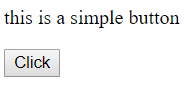
Like all other tags, the button tag is also placed inside the body tag. Button tag has one opening tag and one closing tag. The type of button is defined by using the type attribute. There are three values for the type attribute, button, submit and reset. However, submit and reset are used while creating a form. The text written between the tags appears on the button.
onclick attribute
We used a button tag to create a button. But what happens when this button is clicked? absolutely nothing. To make this button work, We can use the onclick attribute of the button tag.
<html>
<body>
<button type="button" onclick="alert('Hello world!')">Click</button>
</body>
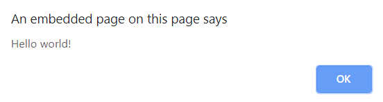
</html>In the above example, whenever a user clicks the button, an alert message appears. In the place of an alert message, we can also place a javascript function. We can decide what to do in this javascript function.
Before clicking the button.

After the button is clicked, an alert message with “Hello world!” appears on the screen.
onclick attribute can also be used with the button tag to make it work as a link. The following code has a button. When clicked, it opens the homepage of google.
<html>
<body>
<button type="button" onclick="window.location.href = 'https://www.google.com/';">Click</button>
</body>
</html>
Button size
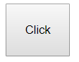
In the above examples, we can see a normal-sized button. There are few ways of increasing the button size. We can use the font-size property of CSS to increase the size of the button, or we can also use the padding property of CSS. The following example uses the font-size property to increase the size of the button.
<html>
<body>
<button type="button" style="font-size: 20px">Click</button>
</body>
</html>
As you can see, the font-size is given twenty pixels. This will increase the size of the button according to the size of the text written inside the button.

Another way is to use the padding property.
<html>
<body>
<button type="button" style="padding: 20px">Click</button>
</body>
</html>
Here, We have set the padding to twenty pixels. Space between the text and the walls of the button will be twenty pixels.
Button type
As I mentioned earlier, there are three values we can give to the type attribute of the button.
1.Button: When we want to use a standard button, we have to give “button” as the value of type attribute.
2. Submit: The HTML form tag has data inside it. We use the type as “submit” to submit the form-data. URL entered in the action attribute of form tag is the place where data is submitted. The following code has a form with submit button.
<html>
<body>
<form action="/action_page.php" method="get" id="nameform">
  First name: <input type="text" name="fname"><br>
  Last name: <input type="text" name="lname"><br>
</form>
<button type="submit" form="nameform" value="Submit">Submit</button>
</body>
</html>
3. Reset: We can also reset the data of a form to its initial values. To do this, “reset” is given as the value of type attribute. The following code has initial values in input fields. We can change the values and then press the reset button to get the initial values inside the input fields. The following code has a form with a reset button.
<html>
<body>
<form action="/action_page.php" method="get" id="nameform">
First name: <input type="text" name="fname" value="john"><br>
Last name: <input type="text" name="lname" value="potter"><br>
</form>
<button type="reset" form="nameform" >Reset</button>
</body>
</html>
Styling buttons
A normal HTML button looks dull. But CSS provides many options to style a button. We can change the color, font size, border color, border-radius, etc, of buttons using CSS. I will explain some ways of making a button look better.
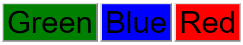
The color of the button can be changed using the background-color property of CSS. The following code shows three buttons with three different colors.
<html>
<body>
<button type="button" style="background-color: green; font-size: 50px">Green</button>
<button type="button" style="background-color: blue; font-size: 50px">Blue</button>
<button type="button" style="background-color: red; font-size: 50px">Red</button>
</body>
</html>
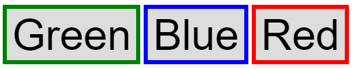
We can use the border attribute of CSS to specify the size, style, and color of a button. The following code shows three buttons with three different border colors.
<html>
<body>
<button type="button" style="border: 5px solid green; font-size: 50px">Green</button>
<button type="button" style="border: 5px solid blue; font-size: 50px">Blue</button>
<button type="button" style="border: 5px solid red; font-size: 50px">Red</button>
</body>
</html>
Observe the value given in the border property carefully. “5px” defines the size of border. Solid is the style, followed by the color of the border. Instead of solid, there are also few other options for border style, like dotted, dashed, groove, etc.
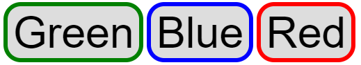
Usually, a button has a sharp corner. We can make these corner rounded by using the border-radius property of CSS. The following code shows three buttons with rounded corners.
<html>
<body>
<button type="button" style="border: 5px solid green;border-radius: 20px;font-size: 50px">Green</button>
<button type="button" style="border: 5px solid blue;border-radius: 20px; font-size: 50px">Blue</button>
<button type="button" style="border: 5px solid red;border-radius: 20px; font-size: 50px">Red</button>
</body>
</html>
Action
Action is an attribute of the form tag in HTML. The action attribute specifies where to send the form data. To use the action attribute, the type of the button should be “submit”.
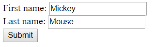
The following code creates a form with two input fields and a submit button. The value of the action attribute should be the URL where the data is to be sent.
<html>
<body>
<form action="/action_page.php">
First name: <input type="text" name="FirstName" value="Mickey"><br>
Last name: <input type="text" name="LastName" value="Mouse"><br>
<button type="submit">Submit</button>
</form>
</body>
</html>
Disabling a button
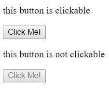
A button is always active by default. This means, all the time it is clickable. We can make a button non-clickable by using the disabled attribute of the button tag. The disabled attribute is a boolean attribute. The following code shows two buttons, one which is clickable and the second one which is not clickable.
<html>
<body>
<p> this button is clickable </p>
<button type="button">Click Me!</button>
<p> this button is not clickable </p>a
<button type="button" disabled>Click Me!</button>
</body>
</html>
Buttons with bootstrap
Apart from CSS, we can use bootstrap to make buttons look better and attractive. Bootstrap provides many classes to modify a button. We can change the color of the button and the size with bootstrap classes. The following code has all the button styles that are provided by bootstrap.
<body>
<button type="button" class="btn">Basic</button>
<button type="button" class="btn btn-default">Default</button>
<button type="button" class="btn btn-primary">Primary</button>
<button type="button" class="btn btn-success">Success</button>
<button type="button" class="btn btn-info">Info</button>
<button type="button" class="btn btn-warning">Warning</button>
<button type="button" class="btn btn-danger">Danger</button>
<button type="button" class="btn btn-link">Link</button>
</body>
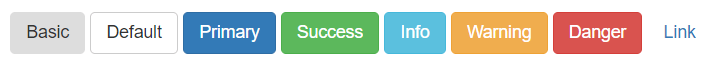
btn is the class for the basic bootstrap button.
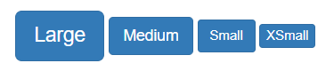
We can also change the size of buttons using bootstrap classes. The following code has all the size classes that are provided by bootstrap.
<button type="button" class="btn btn-primary btn-lg">Large</button>
<button type="button" class="btn btn-primary btn-md">Medium</button>
<button type="button" class="btn btn-primary btn-sm">Small</button>
<button type="button" class="btn btn-primary btn-xs">XSmall</button>
Conclusion
Buttons are very helpful for user interaction. A well-performing button is created by using HTML, CSS, and Javascript. Many options are provided by HTML to work with buttons. All you need is to learn every aspect of it.
